Complete Branding & Design for a Nutraceutical Company that combines Ayurveda & Modern Science
Problem Statement
Bepop Bioscience had no online or offline presence. No social media, no website, no brochures or anything. They did not even had any identity such as logo. Just an idea to fulfill the nutritional gap using the combination of Ayurveda and Modern Science for health and wellness of people.
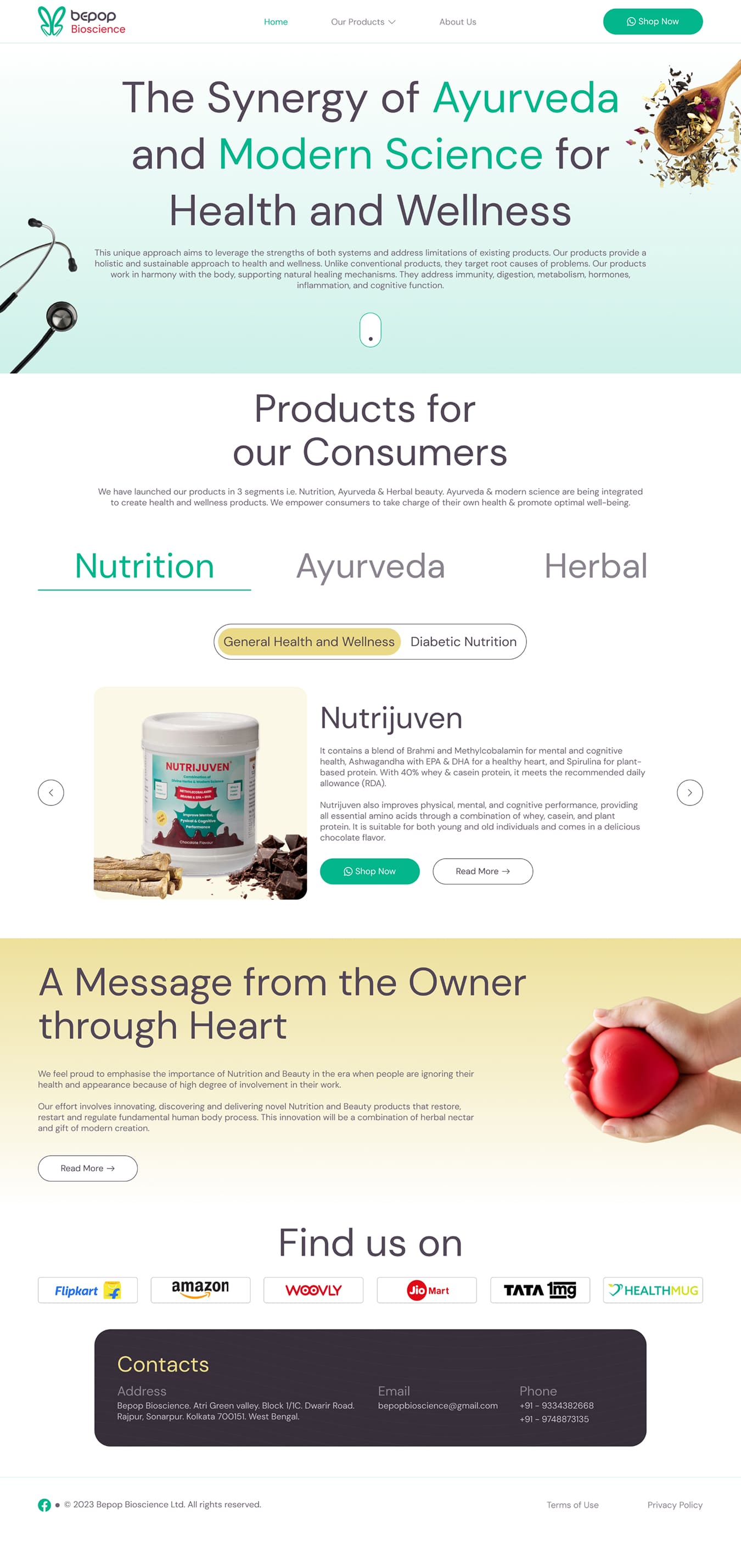
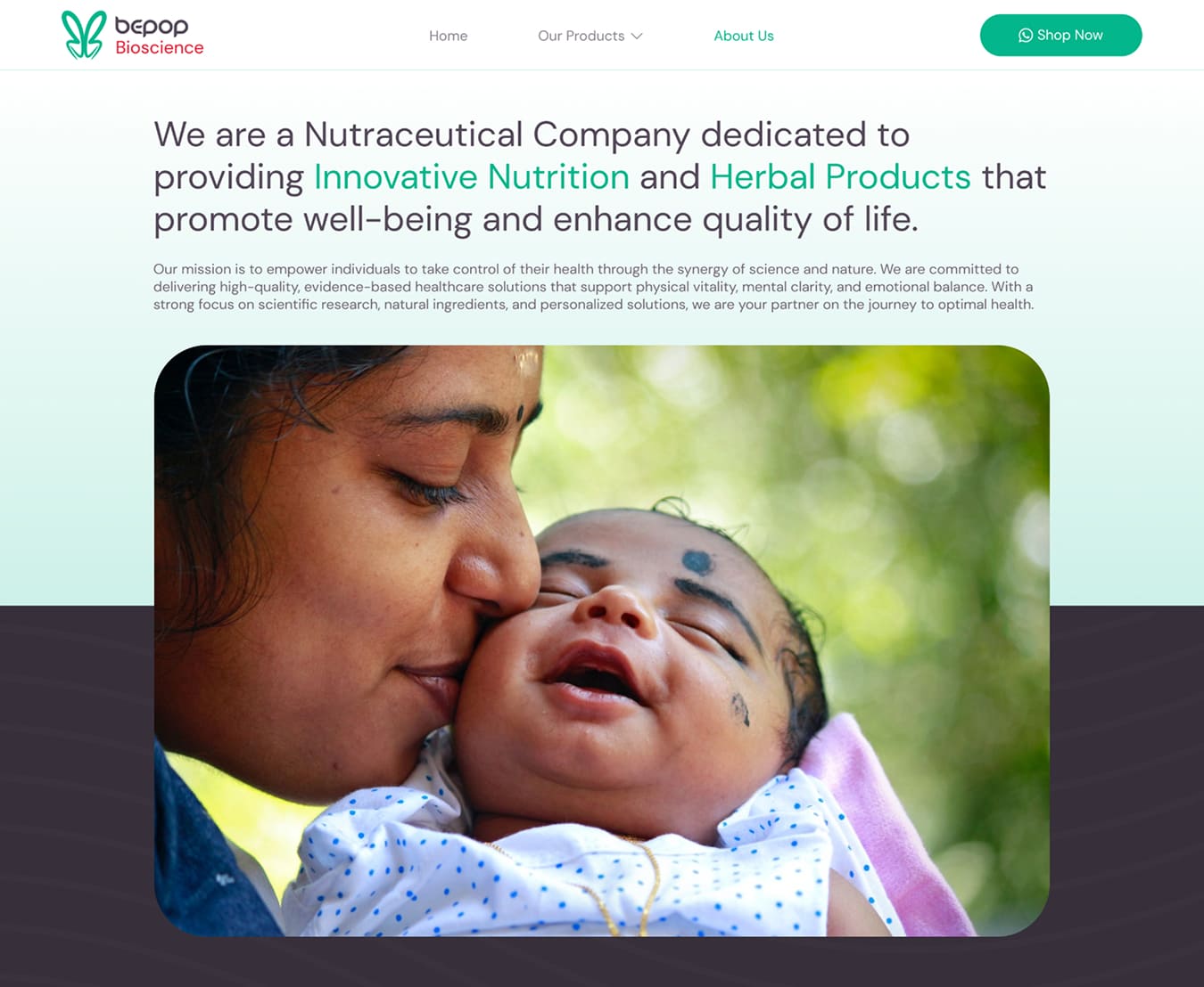
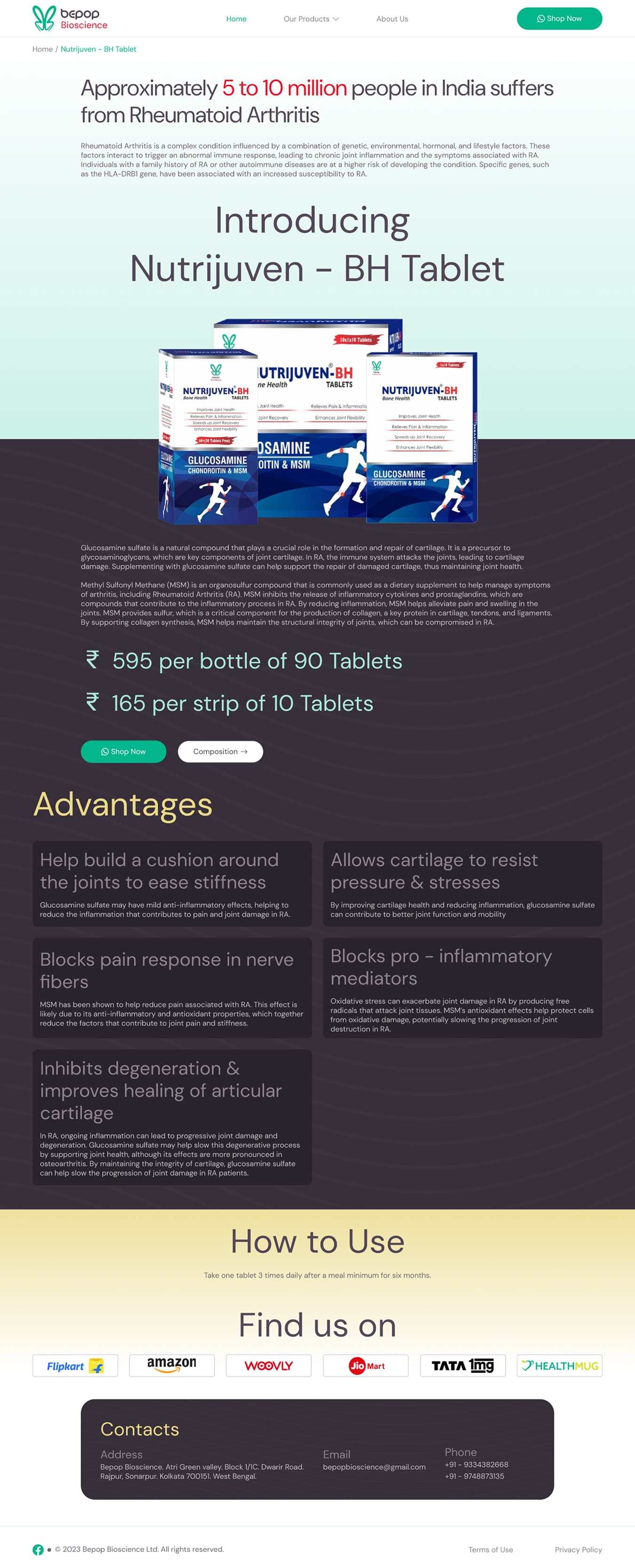
They needed a Brand Identity and complete Branding guidelines for their online and offline presence. Through their website they wanted to highlight major health issues present in Indian population, Why these issues are rising, how they are better than current alternatives, what is the process they use to manufacture their products and how their products work.

Customer Research and Target Audience
Holistically everyone is the target audience for Bepop Bioscience as the company’s goal is to address nutrition fulfillment and India is the largest contributor of undernourished people in the world, with around 194.4 Million people of its population not receiving enough nutrition. In order to structure Branding and Design for company, I had 3 audience type where I was addressing -


Designing the Logo


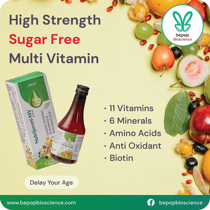
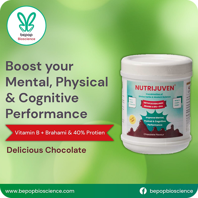
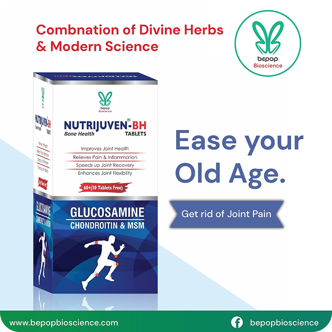
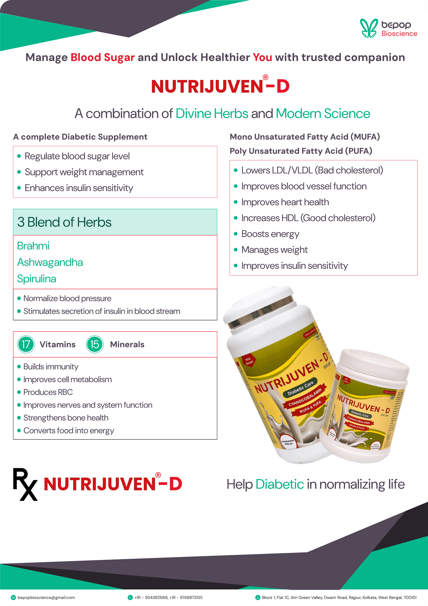
Some social media posts and company collaterals
Creating wireframes
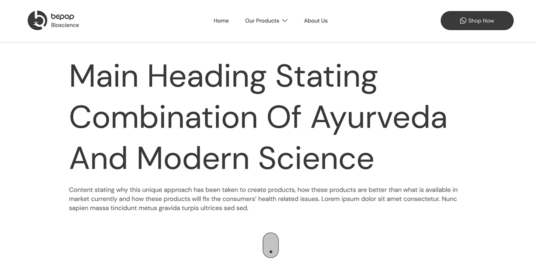
Wireframes didn’t contain dummy content. As stated early, company wanted to fill the nutritional gap by the combination of Ayurveda and Modern Science. The content writer has to know what would headings and related content will contain.
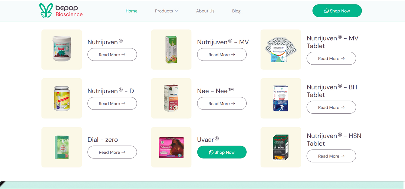
It was also required that all the products should be easily accessible along with fast way to contact. So, a top-fixed navbar was designed with a megamenu with all the products. A WhatsApp CTA was also added.
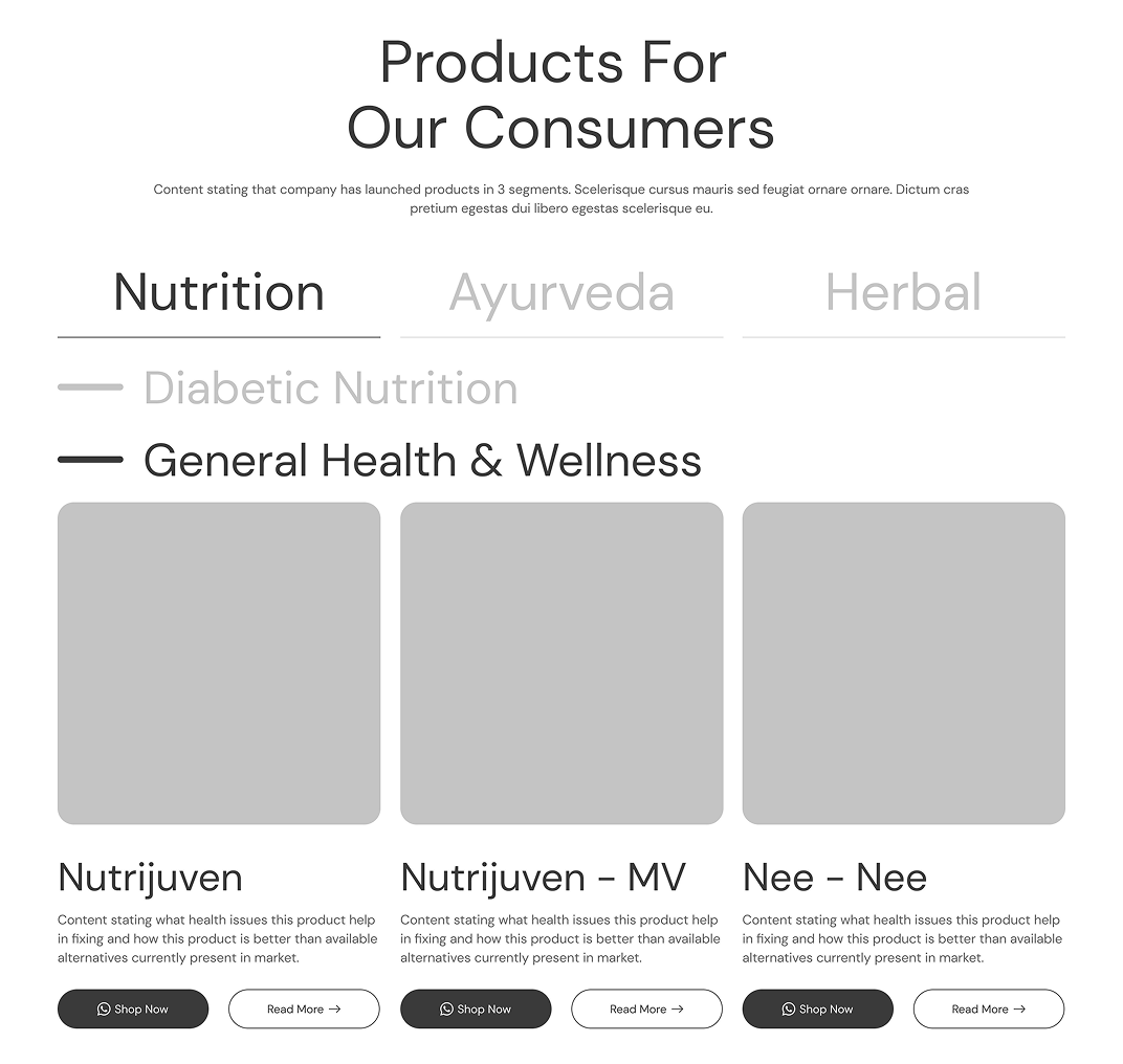
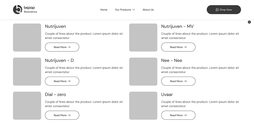
Categories and sub-categories of all the products was defined and content writer knew what sort of content will go on with everything. Same WhatsApp CTA was used to connect if visitor finds something appealing enough.
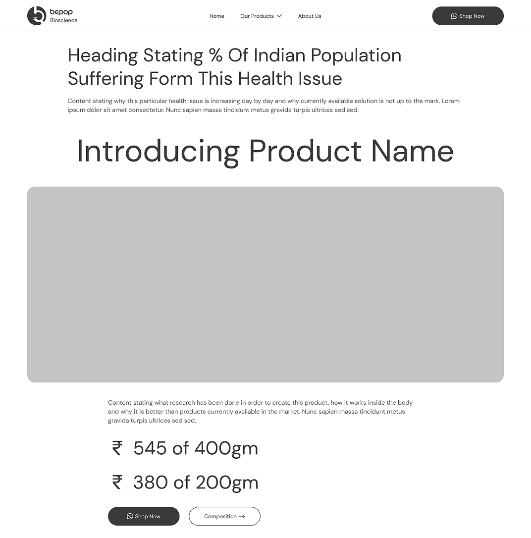
Product description page create a sense of concern data of affected population. It also states why the health issue is increasing. It creates a sense of easiness by depicting how the product is manufactured and how it works along with pricing, creating a sense of motivation for visitor to purchase.
Color Styles, Text Styles and UI Components

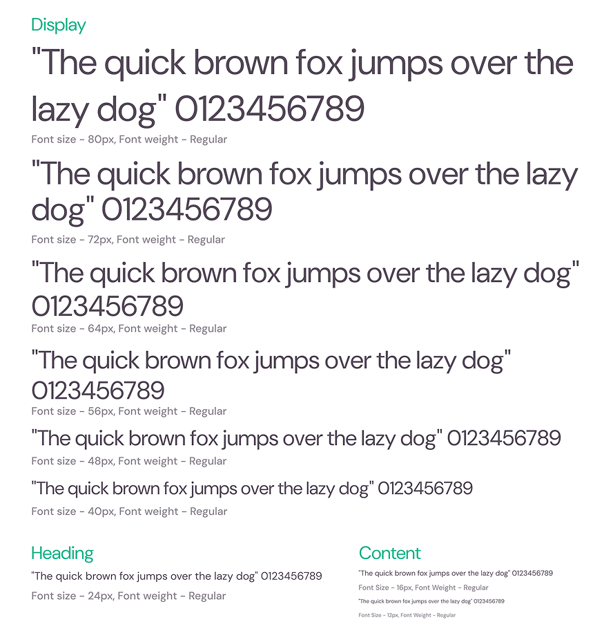
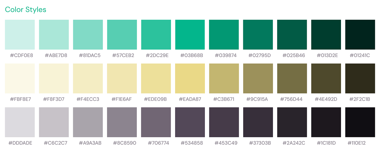
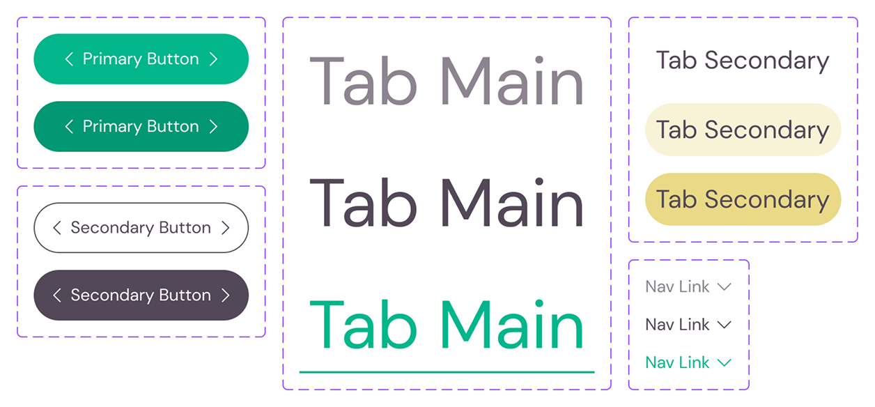
Visual Design